Nº 1

The story of our website

Making creativeworks.com.hk

A Breakthrough of single digit

It was March 27, 2014, and we were sitting in the meeting room talking about what’s next. Our company began in 2005, next year is our tenth year. After 3 offices from Causeway Bay to Kwun Tong, we’re about to jump into a double digit history.

At that time, Kwun and Terence said, we need a fresh start.

We need a fresh start.

The story began from that day

The game has begun. We started to work in Different areas. From planning the development stages, analyzing data, content preparation, to UX and artwork design, implementation and user testing, everything single step was carefully executed. Most people believe that a digital agency could create a new website in just a few hours. However it is much more complicated. Creative web design process is done in stages, from conception to execution, including hundreds steps. It requires deep consideration to ensure users' satisfactions.

At first we expanded the scope, started to talk about what kind of company we might like to be, and what kind of stuff we want to do. Then right immediately we’ve all agreed to several things: we want to focus more on digital marketing, use of new technology with the rise of social media, and with our strength on analysis, we can provide more accurate services. Web design is one of our tools, but more importantly, like a boutique, we are a full service digital agency.

A decade is not eternity, but our world has changed so much especially in digital design and marketing. Within a decade, we witnessed 6 generations of iPhone, the common computer screen size changed from 1024px to 1280px, then back to the phone's 320px to 640px and now 750px with 1080px for the iPhone 6. The 10 years experience makes us more succinct, more focused on the industry.

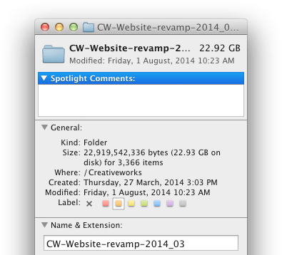
folder

A new decade, we decided to get a new website.

bird on book

We had some thoughts, but we needed to do our homework first...

How did we start

For our website revamp, there is a greater degree of freedom on one hand, on the other hand requires relatively higher standard. We are particularly focused on each steps, as it can be a demonstration of how we work later on.

We quickly set our targets:

  • Demonstrate innovative technologies
  • Show portfolio
  • Share our insights

The target audience would be mainly clients and marketers, followed by students, and people in our industry. Based on these conditions, we set some design and technical specifications, such as Responsive web design, clean design with less distraction, image-based design that can adapt to different media.

Eyes wide open

We started on idea and research, focused on exploring the looks and feels, visual directions, typography, and team preference (after all it is our new website!). I prepared a mood board for team’s overview, which can see the whole picture of colors, looks and feels. We came up with some keywords, the first thought was "bird", "light and shadow", "flat design", "Chinese culture", and of course, not every element was used in final design. Combining the keywords with images, I made a board to show different styles, and established a consensus for the site’s visual. The benefit of making a mood board is able to pre-determine the main visual direction.

Then I drew some sketches and wireframes, from raw idea to experiment and try to put different visual elements into the layout. Like dot-line-plane to graphic design, for web design, the combination of different visual elements constitute a page layout, then different pages constitute a website with complete structure. So, of course, the next thing is to develop information architecture with a sitemap and considering the structure of the site, what should be put together.

Imagine we are the users

And so we started to actually make the website. We were preparing the data and direction before making the actual appearance.

The first design task is to choose the right color scheme. Color palette is all important because it sends an immediate message to website visitors: Bright warm colors easily associated with interesting design. With the company orange as a baseline, we chose some different warm colors as the tone to other web sections.

sections

A paragraph of natural language UIs.
Lorem ipsum dolor sit amet, consectetur adipisicing elit. Sit non, sunt nostrum laboriosam sed quos amet beatae, commodi placeat fugit. Nulla odit praesentium autem debitis impedit quasi, commodi eaque, facere.

_

In recent years, website layouts tend to be a large image combined with a tagline or subtle message. This is also one of our goals, to use image rather than text, and use video to tell the story behind. For the portfolio display, we tend to use single-page narrative design instead of the old boring photo gallery.

Throughout the design process, we had to ensure that the layout design offers the best user experience. The size of fonts or buttons affects the readability and usability so that the pages are not only easy on the eye but allow the users to quickly find what they need. Extended to cross-device compatibility, such as adjusting the layout to fit from smart phones as well as computers with different screen sizes. First I used 960px as a start, completed the first set of desktop layout design. Then moved to other breakpoints: 320, 768, 1220, to complete the layouts designed to meet different screens.

Conclusion

More to come...

Coding
Layout Design
Sketch
Wireframe